You want your Shop customers to be totally satisfied with their purchase. Well, by optimizing your pixel designs (which includes the essential task of boosting both contrast and saturation), you can be assured that their new products will include the best-possible printing results. Refer to this all-encompassing, in-depth guide in order to sell the highest-quality products.
While creating designs is one step of the process, optimizing them for printing is just as important. Spreadshop focuses on digital direct printing, which produces products that are flawless, accurate, and quickly-produced. There are a number of additional benefits, as well:
- Improves the general look and feel of the product
- Printed by new fleet of Brother GTX-3 machines, leading to optimal printing results (see video below)
- Relies on dyed-in-fabric prints, resulting in smooth surfaces (a single, thin color layer is sprayed on the product, meaning the apparel will feel very smooth)
- Can realize color gradients
- Offers infinite number of colors in the design
- Can print practically any design
Pixel Graphics
Ideally, you’ll use pixel graphics in order to take advantage of digital direct printing. What does that mean?
In the simplest terms, a pixel graphic is an image that isn’t a vector image (file types like SVG, AI, EPS, CDR). More specifically, pixel graphics are multicolored images/photos that are composed of individual pixels (picture elements). These pixels are essentially arranged in a grid (explaining the term “grid graphics”). Each pixel contains individual color information, and piecing all of these pixels together completes the final image.
Later on, these pixels will also determine the width and height of the image, all leading to the ultimate size of the print.
Of course, to optimize these pixel images, you’ll have to follow some specific requirements:
1. File format: PNG, JPG, BMP, or GIF
We recommend PNG. This is the most popular/supported files that allow transparent backgrounds (which you’ll learn more about in a moment). There’s also no compression (like in JPGs), meaning it will always be of the highest-quality.
2. Maximum file size: 10 MB
3. Image resolution: at least 200dpi
- “Dots-per-inch,” and it refers to the density of the picture elements.
For example a graphic that is 1000 pixels wide produces a design that’s 12.7 cm wide when printed at 200 dpi. A 2000 pixel-wide graphic produces a 25 cm-wide design. A design with a low pixel width or height (for example, 800 x 600 pixels) can’t be easily enlarged without loss of quality (for example to 12 x 10 cm or more). Because of the “missing” pixels, the print would likely look out of focus and blurred. Therefore, you should only upload designs with sufficient resolution and number of pixels.
4. Minimum size: 50×50 pixels & Maximum size: 4000×4000 pixels
Generally, if you make a pixel graphic for, say, a sticker, you cannot scale it up for clothing. It’s better to go as big as possible within these pixel limitations, as you can always scale down. In most cases, 10MB is a plenty to work with (it’s unlikely you’ll hit this limit, anyway).
5. Design must be isolated
If you want to print a motif that’s cut out of a photo or picture, a white background won’t do (this would end up being printed on the product, including white and colored products). Instead, you’ll want to assure that the background is transparent (meaning the printer ignores it). Our Help Center provides a step-by-step tutorial for this process.
6. Adjust Contrast, Saturation and Brightness
Perhaps most importantly, when preparing your pixel designs, you’ll want to consider the differences in colors between the screen and print. Just because it looks good on the screen, it doesn’t mean it will look good on the product. Fortunately, there are several tips you can keep in mind to assure the best quality.
Generally, colors will appear brighter on a screen than on a printed shirt. This can partly be attributed to the resolution of your monitor, but this is also due to the fact that we need to render the color scheme from RGB to CMYK, leading to some minor alterations.
To work around this, you should increase the contrast and saturation of your design. Don’t be afraid of increasing these levels; even though the design may look a bit jarring on the screen, you’ll see better results when the product is printed. Secondly, you should always upload your graphics in RGB mode. Our software specifically works with that color scheme, and that will lead to fewer color deviations (when compared to CMYK files).
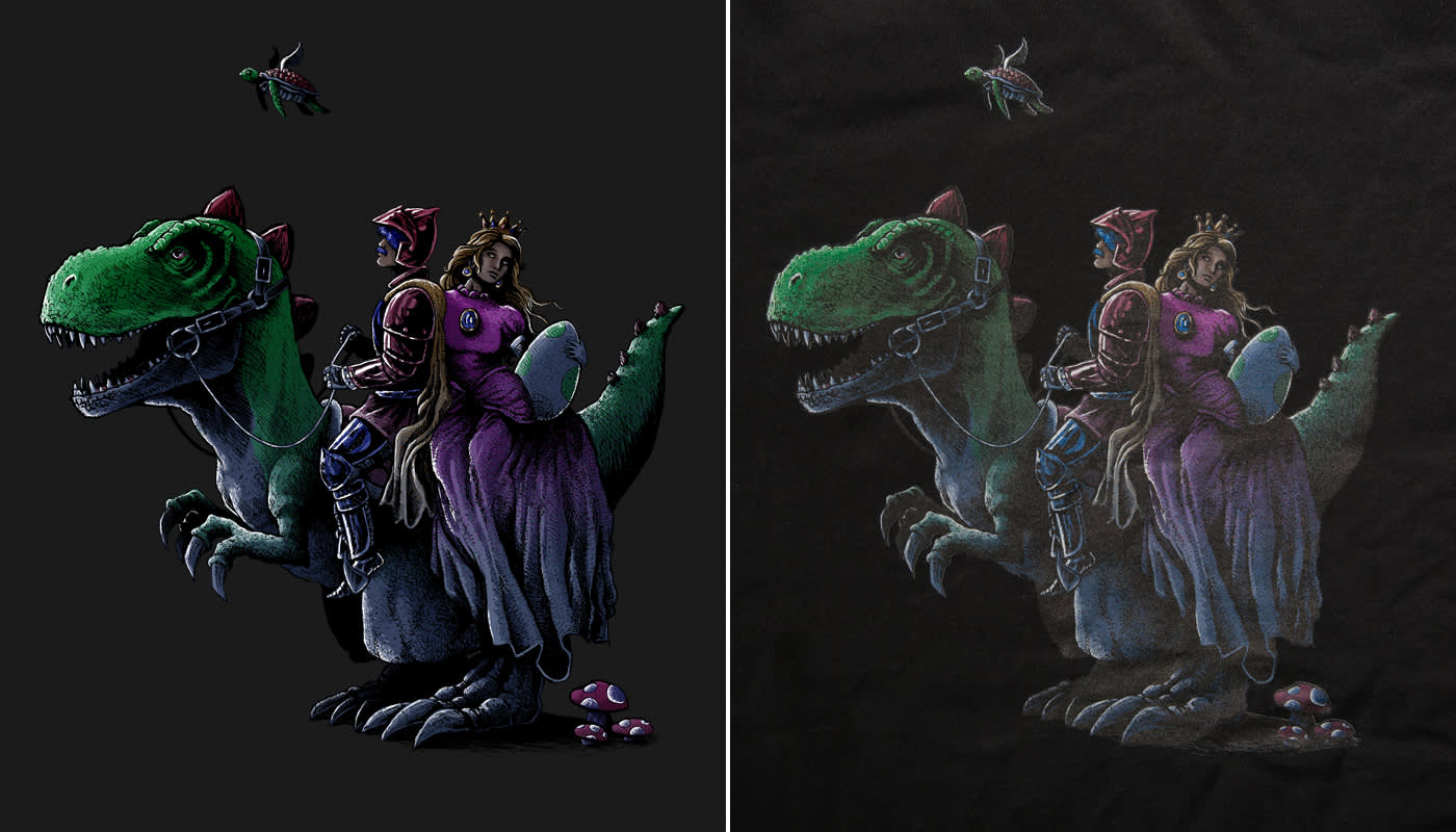
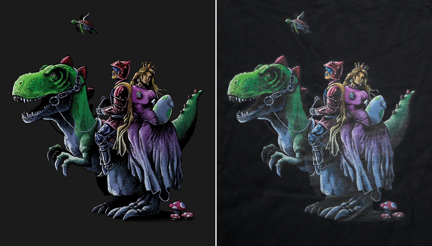
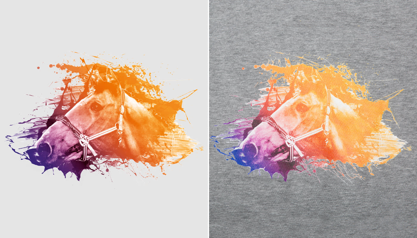
To better illustrate these concepts, we have a couple of examples: one illustrated design and one design based on a photograph.
The images on the left are the digital images that you see on your screen. The images on the right shows how the image looks printed.
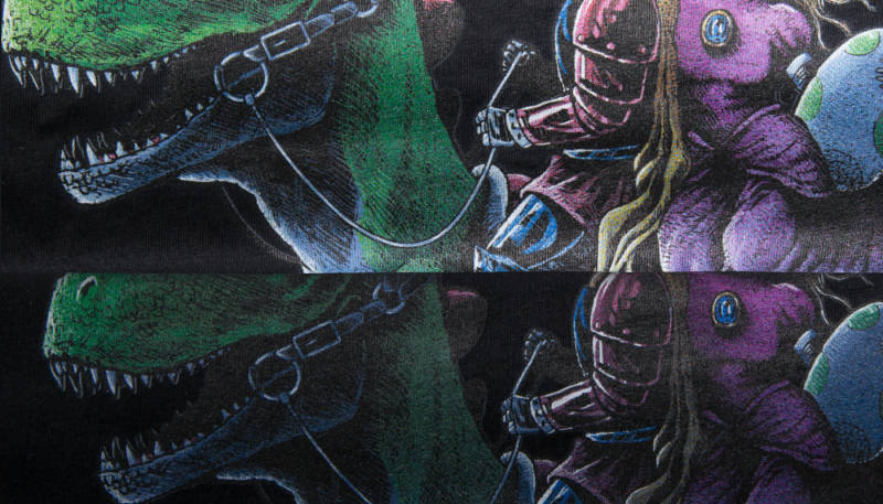
Before adjusting contrast, saturation & brightness:
After adjusting contrast, saturation & brightness:
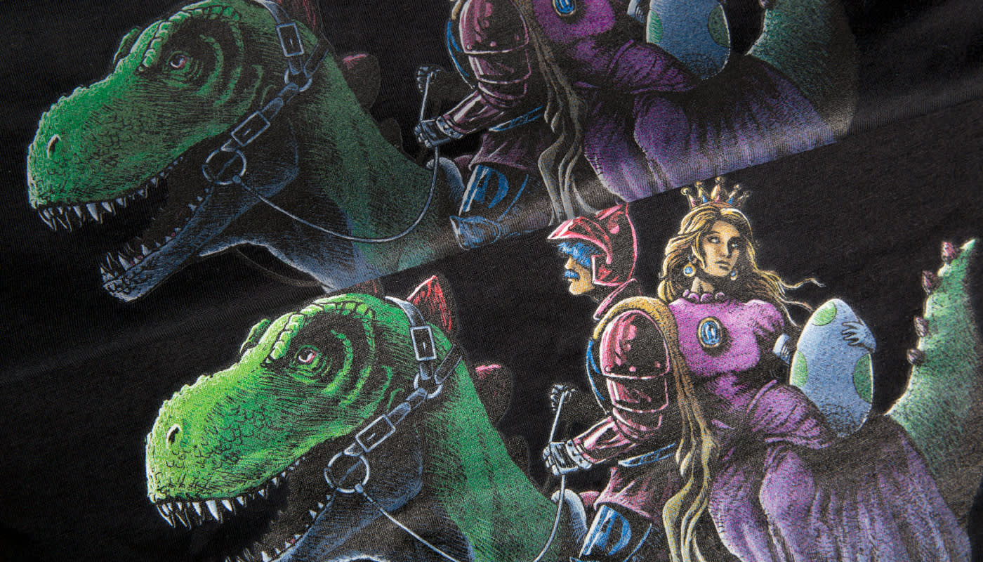
In the before-row, you can see that even if the design is dark, the image shows a lot of detail and definition. Unfortunately, this isn’t something that will print well. It’s clear that the print is grainy, is way too dark, is not really visible, the colors are dull, and the design lacks overall definition and that much-desired “dramatic look.”
However, when the design is properly adjusted, the print starts to show vibrant colors and high definition, and the smaller, darker details become visible. This is true even if these attributes aren’t clear on your screen.
Before adjusting contrast, saturation & brightness:
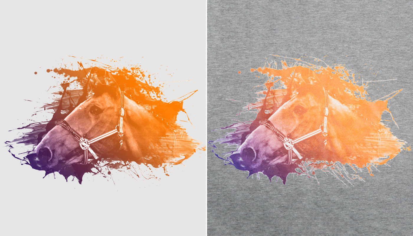
After adjusting contrast, saturation & brightness:
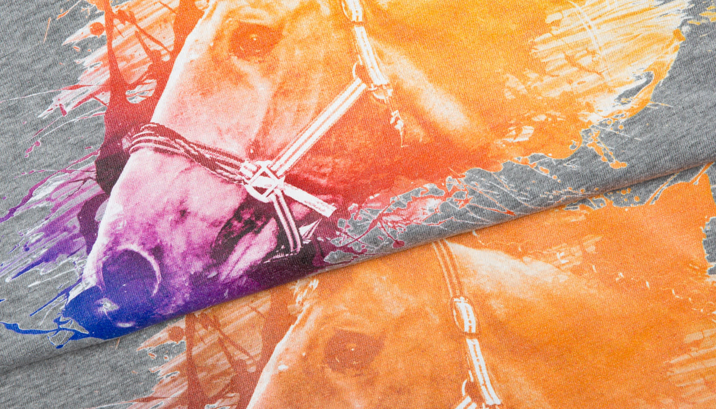
The same can be seen with this design. Photographs usually have infinite details, and the accompanying designs are very defined. The “before” design looks great on the screen, but the print shows rather dull color gradient, and a large amount of texture, definition and detail gets lost in the print. For instance, look at the horse’s neck, the splatter, the ears etc.
The “after” design shows much richer color gradient and a much more defined and detailed print. The different textures and details are visible.
So how do you know how to adjust the design?
There’s a bit of guess work involved. As you can see in the designs below, the brightness and contrast settings are quite different for the two images. The darker your image is, the more it can take brightness. If you have small details and textures with low contrast (like the horse illustration), the design usually needs a bit more contrast.


Finally, the color of the fabric could also have an impact on the print result. See more details in our FAQ section, and explore some real-life examples over in our Help Center.
Do you have an experience optimizing your designs? Are you having any difficulties with the methods? Let us know in the comments below!
I noticed about file size limitation and that is really helpful.
Great information. I appreciate the training. Thank you
I got my stickers with transparent backgrounds in png format but I cannot get it in 200 dpi. Do I must register my designs or this is optional?
Thank you, I was hoping you would give pointers on the best way to optimize images for Spreadshirt.
This is the perfect answer to all of my questions along with the Canva App. Thank you!!?
This information is just what I’ve been looking for. Thanks.
Jay
Happy to hear we could help 🙂